Typeface styles
Formal elements
The formal Elements are:
Shape
a bold shape or outline is one of the strongest ways of singling out an object or person, giving it or them a sense of separation from their environment
Line
Line can be used to create more complex shapes or to lead your eye from one area in the composition to another
Form
- The term "form" refers to the volume and solidity of an object.
- It can be shown in two-dimensional photographs through tone graduation (shading), although shape contributes greatly too.
Texture
- Texture is concerned with surface - for example, the tight smooth skin of an apple, or the pitted surface of corroded metal.
- The visual appearance of texture in photographs suggests how they would feel to your touch.
- Subjects containing a rich mixture of textures are especially rewarding because of the ability to contrast one surface with another.
Tone & Colour
Thinking about colour and tone values in order to develop an understanding of composition; colour and tone both contribute greatly to emphasis and mood.
Pattern
- The pattern is appealing to the human eye, whether repetitive and formal or irregular and off-beat.
- By finding and exploiting visual patterns in a scene you can create a point of interest.
Shape
image taken by myself
This image was my choice because it features a multitude of rectangular and square shapes.
Line
image taken by myself
I selected this image due to the captivating effect of the multiple lines formed by the tiles on the wall, which I find visually appealing.
Form
I chose this image because the unique dents made by the rocks on the clay vase caught my attention and the shape is unusual.
Texture
image taken by myself
I selected this image because it effectively conveys the texture of both the brick wall and the black wall.
Tone & Colour
image taken by myself
I chose this picture because the pink and grey house colours look great together, and the green plants add life to the picture.
Pattern
image taken by myself
I chose this because the roof pattern caught my eye.
Light and photography
Batory Photoshop
To create this image, I started by opening Photoshop and making a new A4 document. I added a flower image I found online and imported it. Then, I found an eye image and opened it in a separate Photoshop file.
I cut out the eye and placed it onto the flower as a new layer. Then I merged the layers, I cleaned up the edges to make it blend nicely. I centred the eye on the flower, adjusted its colours, and merged it with the petals to make it look like a natural part of the flower.
Finally, I added text and shaped it to my liking.
In conclusion, I believe the image could be improved by adding more flowers for a more captivating look.Audience theories
Question 1: What are the possible criticisms of the Hypodermic Syringe Model Theory? What does the theory assume about the audience?
It has been criticized for oversimplifying the communication process and ignoring the role of the audience in media messages.
Question 2: In your opinion what are the positives and negatives of the Two Step Flow Theory?
One positive is, that it helps identify and reach the most influential and credible sources of information for a given topic or issue. Another positive could be that the two-step flow theory can help you design more effective and persuasive communication campaigns by identifying and targeting the opinion leaders in your audience. However a negative could be that It can be difficult to find and access the relevant opinion leaders for a specific campaign or objective, and finding the wrong leader may cause some problems.
Question 3: Explain an opinion leader (Two Step Flow Theory) that you seek opinions from. Why do you trust their opinion?
An opinion leader could be iJustine. She's mostly known for doing tech reviews on YouTube and covers various aspects of technology and lifestyle making her a well-known figure in the online tech and entertainment community. I trust her opinions because she gives factual information about a product she might be promoting, and she is a trusted well-experienced professional in technology. She also tests the product and gives out positives and negatives about the product which shows that she is honest.
Question 4: Can you separate the three Media theories (see below) into theories that assume an active audience member and theories that assume a passive audience?
1. Hypodermic Syringe Theory
Assumes a passive audience because they do not question anything and usually the media feeds them.
2. Two-step flow theory
Assumes an active audience that is influenced by opinion leaders or intermediaries.
3. Uses and Gratifications Theory
Assumes an active audience because they are more opinionated.
Question 5: What are the Primary Target Audience Demographics for Guinness ‘Wheelchair Basketball’ advertisement?
Age:
25-35. The protagonists of the advertisement are all in this age range suggesting the age range of 25-35 is being purposely targeted through casting.
Gender:
Male. All the protagonists and even the briefly seen barman are male. There is no attempt to target a female audience.
Race/Region:
White. All characters except for one bar Extra are white. Mid-east accented narration suggests they are targeting a larger American region.
Class/Social Status:
Lower Middle C1/B. While socialising at the pub could be considered a lower-class activity the renting of a gym and wheelchairs suggest a primary target audience with a reasonable disposable income.
Interests:
Guinness drinkers, sports especially basketball, disabled sports and rights, socialising with friends.
Communication/Audience theories help us understand how media affects society. The Hypodermic Syringe Theory suggests that mass media injects messages directly into passive audiences, like a drug. For example, "Reefer Madness" aimed to influence how people saw marijuana. In contrast, Cultivation Theory says that watching a lot of TV can make you see the world as more violent and dangerous, as seen in shows like "CSI." The Two-Step Flow Theory says information passes through opinion leaders before affecting public opinion, like a political commentator on a news show. Finally, the Uses and Gratifications Theory shows how people use media for various needs, like using Instagram for socializing, self-expression, or entertainment.
Composition in Photography
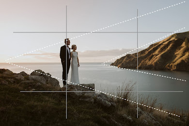
Rule of thirds
The Rule of Thirds in photography means dividing your picture into nine equal parts using imaginary lines. You place important things along these lines or at the spots where the lines intersect. This helps make your photo look more interesting and balanced, instead of putting everything in the center. It guides the viewer's eye to explore the whole image.
Leading Lines
Leading lines in photography are lines in a picture that help direct your eyes to the main subject. These lines can be real, like a road or a river, or they can be suggested by objects like fences or even shadows. They make the photo more interesting and help you focus on what's important in the picture.
Patterning:
Patterning is when you take pictures of things with repeating shapes or colours, like tiles or rows of objects, making the photo look organized and pleasing.
Symmetry:
Symmetry is when you take photos where one side is like a mirror image of the other, creating balance and harmony. It's often seen in reflections or symmetrical scenes.
Depth of Field in Photography:
Depth of field in photography means deciding what's in focus and what's blurry in a picture. A small depth of field blurs the background, great for portraits, while a large depth of field keeps more things sharp and is often used in landscapes. You can control it by changing settings like the camera's aperture.
Viewpoint:
Viewpoint is about where you put the camera and how you point it to take a picture. It affects how things look in the photo, making them seem big or small, and helps you show what you want in the picture.
Birds Eye View:
The viewer is looking down at the subject.
Worms Eye View:
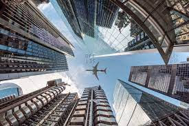
The viewer is looking up at the subject.

Genres
Comedy:
Comedy is a genre that aims to entertain and amuse the audience through humour, wit, and lighthearted situations. It often involves exaggerated characters, funny dialogue, and humorous plot developments.
Romance:
Romance is a genre that focuses on love and romantic relationships as central themes. It explores the emotional and often passionate connections between characters and may include elements of drama, comedy, or other genres.
Action:
The action genre is known for its high-energy and thrilling sequences, often involving physical combat, chases, and daring stunts. It emphasizes excitement, adrenaline-pumping moments, and intense conflicts.
Adventure:
Adventure films typically follow characters on exciting journeys or quests, often in exotic or dangerous settings. They involve exploration, challenges, and the pursuit of a goal or treasure.
Crime:
Crime genre stories revolve around criminal activities, investigations, and law enforcement efforts. They often explore the motives and consequences of criminal behaviour and may include elements of mystery and suspense.
War:
War films depict military conflicts, battles, and the experiences of soldiers during wartime. They often focus on the human cost of war, the camaraderie among troops, and the moral dilemmas faced in combat.
Horror:
Horror films are designed to evoke fear, suspense, and terror in the audience. They often feature supernatural elements, monsters, or psychological threats that create a sense of dread and unease.
Family:
Family films are suitable for all ages and aim to entertain and engage viewers of different generations. They often convey positive values, life lessons, and relatable family dynamics.
Western:
Western films are typically set in the American Old West during the 19th century and feature cowboys, outlaws, and frontier life. They often explore themes of justice, rugged individualism, and the clash between civilization and the wilderness.
Animated:
Animated films are created using animation techniques to bring characters and stories to life. They can cover a wide range of genres, from comedy and adventure to fantasy and science fiction.
Sci-Fi (Science Fiction):
Science fiction films explore futuristic or speculative concepts, often involving advanced technology, space travel, and extraterrestrial life. They delve into scientific and philosophical themes.
Fantasy:
Fantasy films transport viewers to imaginary worlds filled with magic, mythical creatures, and supernatural elements. They often involve epic quests, heroism, and the battle between good and evil.
Musical:
Musical films incorporate music and dance as integral elements of the storytelling. Characters express their emotions and advance the plot through songs and choreographed sequences.
Digital Image Types
How does resolution affect image quality and size?
Resolution affects how good images look and how big their files are. Higher resolution means sharper and more detailed pictures but also larger files. It's crucial for clear viewing and printing. Lower resolution can make images look blurry and pixelated, especially when enlarged. It's essential to choose the right resolution based on your needs, with higher resolutions for top-quality images and lower resolutions when smaller file sizes are required.
What are the differences between these? JPEG, PNG, GIF, SVG
- PEG (and JPG): Good for photos, millions of colours, small file sizes, and no transparency or animation.
- PNG: Good for images with sharp edges, transparency, and simple graphics.
- GIF: Used for simple animations and images with limited colours, supports transparency and animation.
- SVG: Ideal for logos, icons, and graphics that need to be resized without losing quality, not for photos.
InDesign Practice
To create the passport cover, I inserted a rectangle shape and adjusted its size to fit the page. After that, I changed the fill to a light pink color. In the middle of the rectangle, I added a gradient-like circle with pink, blue, green, and yellow colours. To complete the design, I inserted text at the top and bottom of the passport and modified the font and color to match my creative visual ideas.
I started by opening a document with dimensions of 297 x 210 mm. I adjusted the workspace to "Essentials Classic" in order to access additional options. Then, I used the pen tool to draw a single line at the top of the page. I removed the fill and changed the colour of the stroke to pink.
To duplicate this line, I selected the object and went to "Object > Transform > Move". After that, I adjusted the vertical position to 2 units and clicked "Copy". To quickly create multiple lines, I pressed "Ctrl" and "D" on my keyboard.
Next, I activated the "Warp Tool" by pressing "Shift" and "R". Then, while holding down the left mouse button, I adjusted the lines to precisely align them to my preferred configuration.
In conclusion, I believe I did well on this project, but there is always room for improvement. For instance, I could have added different coloured lines to make it more visually appealing.
To create this design, I imported the pattern from my passport to use as the background. Next, I adjusted the columns and margins to create a guide for myself. After that, I added the text and customized it to my liking. However, I must admit that the colour I used for my personal information is difficult to read. Finally, I added an emblem, which I created by inserting a circle, removing the fill, and changing the stroke.


No comments:
Post a Comment