Mind Map for Harrow:
Current Colour Scheme For Harrow:
Harrow is a beautiful borough in London, known for its unique architecture. The buildings in Harrow are characterized by a colour palette that includes tranquil aqua, deep shadows, and rustic brown hues. These colours are carefully chosen to create a calming and peaceful atmosphere in the borough. Additionally, subtle accents of green are used to evoke a connection with nature, which is also an important aspect of Harrow's identity.
However, to make Harrow more attractive to tourists and to promote its development, it would be beneficial to consider adding a wider range of colours to the current muted and boring colour scheme. This could include brighter hues of blue, red, yellow, and orange, which would add vibrancy and energy to the buildings. By doing so, Harrow can create a more lively and dynamic atmosphere that would appeal to a wider range of visitors and help establish it as a must-visit destination in London.
Notting Hill Colour Scheme
Located in the western part of London, the neighbourhood of Notting Hill is a feast for the eyes with its picturesque and colourful houses that are a testament to the area's rich history and unique character. The houses are painted in a range of vibrant colours such as Oyster Pink, Tasman, Carnation, and Chatham Blue, creating a stunning sight for visitors. The use of these colours is not just for visual appeal; they also reflect the creativity and individuality of the residents who have made Notting Hill their home.
The architectural style of the houses is just as diverse as the colours used to paint them. From the elegant Georgian townhouses with their grand entrances to the charming cottages with their quaint gardens, there is something for everyone in Notting Hill. The area's architecture is a reflection of its evolution from a rural village to a fashionable and vibrant neighbourhood that is home to people from all walks of life.
Notting Hill's unique and colourful character has made it a popular destination for tourists from all over the world. Its vibrant atmosphere, rich history, and stunning architecture make it a must-visit destination for anyone looking to experience the true essence of London.
Logo/Slogan for Harrow
In my opinion, the logo could benefit from more colours to enhance its creativity, character and overall appeal. Currently, it appears dull and lacks uniqueness. Perhaps by incorporating a pattern or another shape, it could distinguish itself from other logos in London.
Brent Logo:
I believe Brent is a great example of a logo due to its attractive range of colours and simplistic yet visually pleasing design.
My logo for Harrow:
To create this logo, I started by creating a new layer and adding a circle shape using the ellipse tool. Then, I double-clicked on the layer to change the gradient and colour to the desired look. I added a black stroke to the shape and resized it to the correct size. Next, I added text and changed the size and font to my liking. I then modified the text "London Borough" to an arc style and adjusted it according to my preference. I did the same with the "Harrow" text, adding a stroke and warp to it as well. Finally, I added a tiger and filled it with black.
To conclude, the logo could have been enhanced by incorporating a pattern or another shape to make it more visually attractive. I believe that the new logo is a better fit for Harrow as it has more colour and character. Overall, I am confident that I have completed this task successfully.
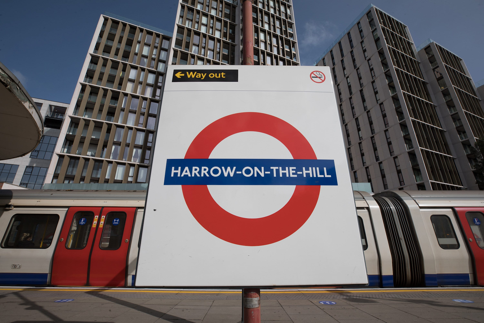
Harrow offers various modes of transportation such as trains and buses. According to the Transport for London website, Harrow has 10 Tube stations, three London Overground stations, and about 430 bus stops. You can view all 39-day bus routes in Harrow on their website.
The train stations in Harrow:
Bike Lanes/ Trails in Harrow
Primary Research Photos
Sketches of new transport
Final Colour scheme
Before:
Final Slogan:
Harrow: Where heritage meets tomorrow's horizon.
I chose this slogan because it aims to convey a sense of the London Borough Of Harrow blending its rich historical heritage with a forward-looking and promising future.
Harrow: The location itself, provides a sense of place and identity
Where Heritage Meets: Highlighting the borough's historical and cultural roots, emphasizing its traditions and legacy
Tomorrow's Horizon: Indicating a forward-thinking approach, suggesting progress, innovation and a positive future outlook.
Final Transport:
Evaluation
Colour scheme
I selected a colour scheme that incorporates pastel hues to revitalize the town. The reason behind choosing bright and lively colours is that they can evoke joy and positive emotions in visitors. The goal is to create a pleasant and welcoming environment that will make the town more attractive and appealing to tourists. The pastel theme also enhances the overall aesthetics of the town, giving it a charming and elegant appeal.
Logo
I started creating this logo by making a new layer and adding a circle shape using the ellipse tool. Then, I double-clicked on the layer to change the gradient and colour to the desired look. I added a black stroke to the shape and resized it to the correct size. Next, I added text and adjusted the size and font to my liking. After that, I modified the text "London Borough" to an arc style and adjusted it to my preference. I did the same with the "Harrow" text, adding a stroke and warp to it as well. Finally, I added a tiger and filled it with black.
To sum up, I think that adding a pattern or another shape would make the logo more visually appealing. However, I believe the new design is a better fit for Harrow because it has more colour and character. Overall, I have successfully completed this task.
Transport
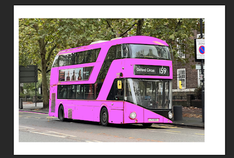
I think the current red buses in Harrow are not very attractive and do not add any vibrancy to the city. So, I had an idea to paint them pink and make them more joyful. We can even incorporate other colours like blue, yellow, and green as part of the bus colours. I did this myself by using the magic wand tool in Photoshop to change the colour and fill it with my desired colour.
Slogan
I chose this slogan because it aims to convey the idea of the London Borough of Harrow blending its rich historical heritage with a promising and forward-looking future. The location of Harrow itself provides a sense of place and identity. 'Where Heritage Meets' highlights the borough's cultural and historical roots, emphasizing its traditions and legacy. 'Tomorrow's Horizon' indicates a forward-thinking approach, suggesting progress, innovation, and a positive future outlook.


No comments:
Post a Comment